Simple Marriage Biodata Format: What to Include
Learn what to include in a simple marriage biodata format, what to leave out, and how to make a biodata feel clean, complete, and easy for families to read.
Quick answer
What this guide helps with
- Understand what a simple marriage biodata should include.
- Separate must-have details from optional sections.
- Build a biodata that feels clean without looking incomplete.
Simple marriage biodata format
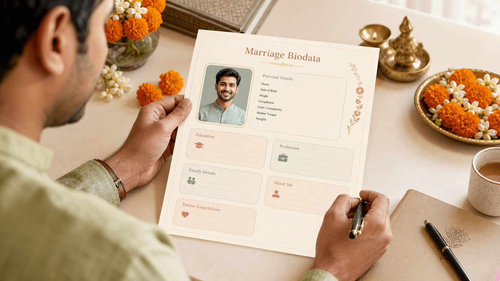
A simple marriage biodata format is a clean, structured profile layout that presents the core personal, family, and lifestyle details clearly without heavy decoration or unnecessary filler.
Key takeaways
- Simple does not mean empty; it means edited.
- Strong structure matters more than more sections.
- A calm layout often creates more trust than a premium-looking but crowded design.
What simple actually means
Simple biodata formats are not about removing everything. They are about choosing the details that help families understand the person quickly and comfortably.
Must-have sections
Name, age, height, education, profession, location, family background, and a short introduction or summary.
Optional sections
Horoscope details, hobbies, expectations, social links, or extra family context only if they are genuinely useful.
- Keep the first page focused on identity and key profile details.
- Group similar fields together instead of scattering them.
- Use one clear photo if you want to include one.
- Prefer readable headings over decorative separators.
What to include in a basic format
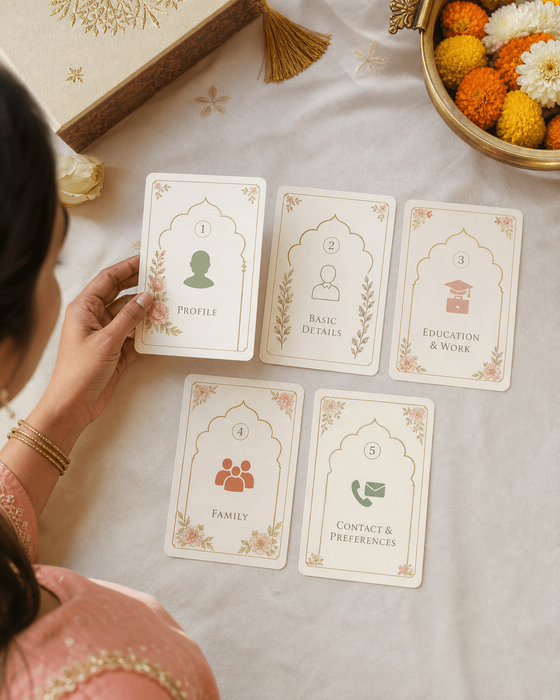
What this visual is showing
A simple format does not need to feel plain. It can still use warmth, soft color, and good typography while keeping the actual reading experience direct.
That balance is what many Indian families respond well to: enough design to feel polished, but enough restraint to keep the profile trustworthy.
What to leave out
Repeated details
Corporate language
Decorative overload
A simple biodata works because families can understand the person quickly, not because the page looks empty.
Common mistakes
Removing so much that the biodata feels incomplete
A minimalist page still needs enough context for families to make sense of the profile.
Using a generic template without editing section order
Even simple layouts become weaker if the information appears in the wrong sequence.
Writing long explanations inside every section
The biodata stops feeling simple once every field becomes a paragraph.
A safe simple order
- Name and photo
- Personal details
- Education and profession
- About me or short summary
- Family background
- Optional details only if needed
What should be included in a simple marriage biodata?
Include the key personal details, education, profession, family background, and a short introduction. Add extra sections only when they improve clarity.
Is a simple biodata better than a traditional one?
A simple biodata is often better for digital sharing and readability, but it still needs to include the cultural and family details your audience expects.
How long should a simple marriage biodata be?
One to two pages is usually enough, as long as the first page already presents the main profile clearly.
When to use the tool
Build a cleaner, simpler biodata