Marriage Biodata Format: Traditional vs Modern Layouts for Indian Families
Compare traditional and modern biodata formats, when each works best, and how to choose a layout that feels right for your family and sharing style.
Quick answer
What this guide helps with
- Choose between traditional and modern biodata layouts with more confidence.
- Understand which format works better for family-first review and WhatsApp sharing.
- Avoid layout choices that make a biodata feel messy or hard to scan.
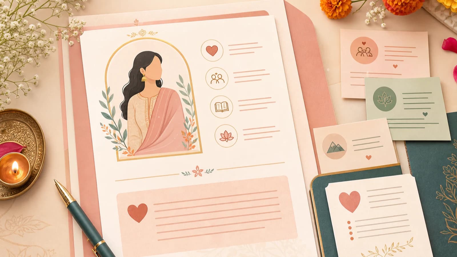
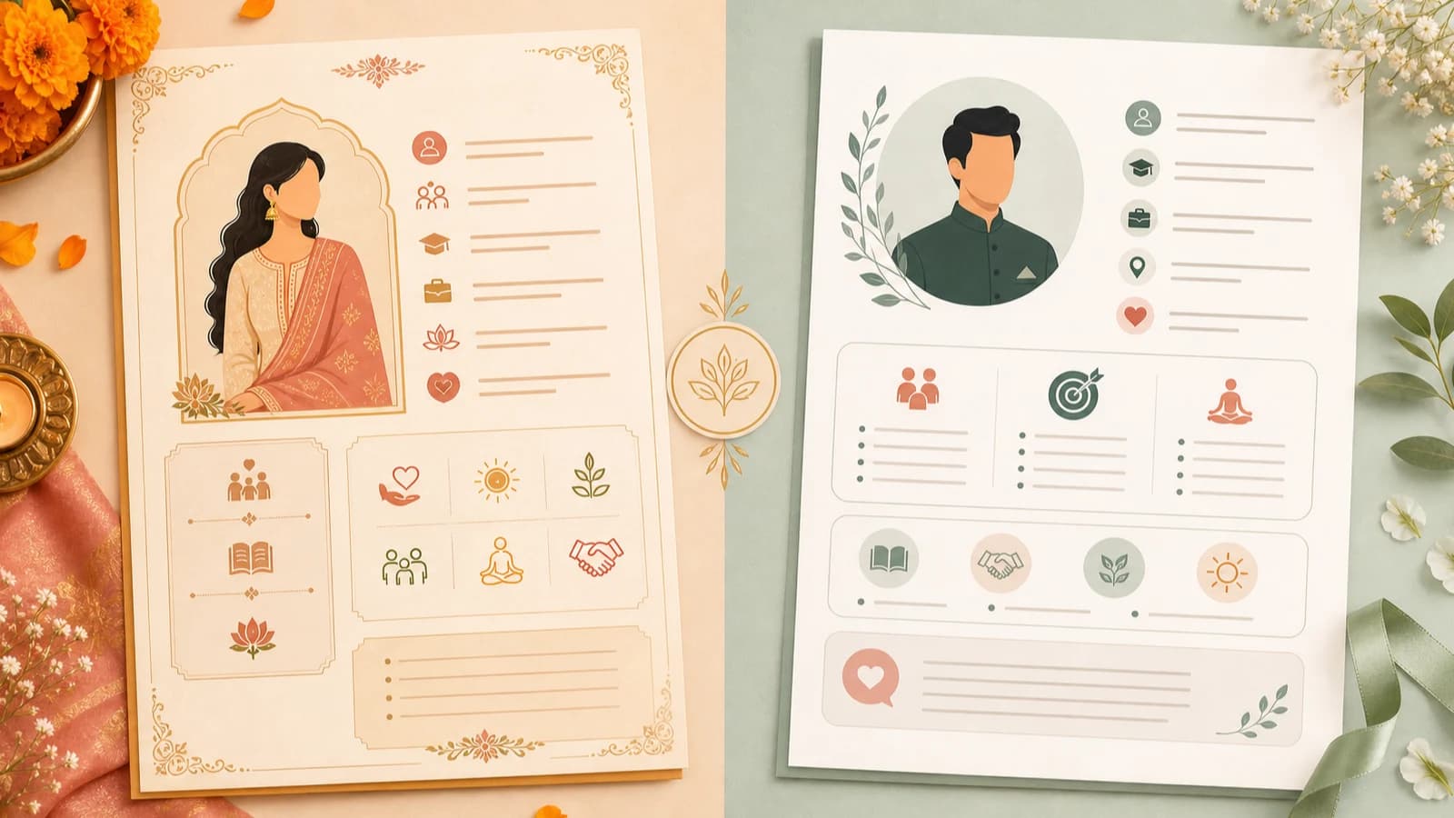
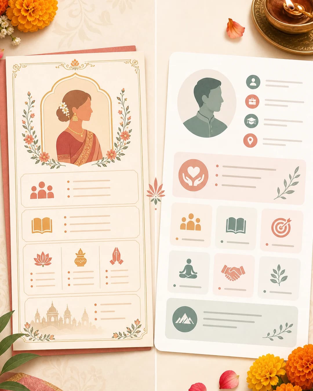
Traditional vs modern biodata
Traditional biodata layouts usually emphasize structure, family details, and formal presentation. Modern layouts focus more on readability, cleaner spacing, and balanced personal presentation.
Key takeaways
- Family context matters more than trendiness.
- For most digital sharing, clean modern layouts are easier to read.
- The real problem is visual clutter, not whether the format is traditional or modern.
Which format should you choose?
The answer depends on who will read it first and how it will be shared.
What this comparison is showing
Traditional biodata layouts usually feel more familiar, decorative, and section-led. Modern layouts usually rely on spacing, simpler hierarchy, and a presentation that performs better on phones and shared PDFs.
This does not mean one is automatically better. The right choice depends on whether family familiarity or digital readability is the stronger requirement for your use case.
What traditional formats do well
- They feel familiar to many families.
- They often make religious, family, and biodata sections easy to locate.
- They can feel more formal and trusted in conservative contexts.
What modern formats do better
- Cleaner spacing improves mobile readability.
- Profile photo and About Me sections feel less cramped.
- The document looks better when shared digitally, not just printed.
Common mistakes
Choosing a design that looks premium but reads poorly
Families struggle to scan the document, especially on WhatsApp or mobile PDF previews.
Using a very traditional layout with cramped spacing
Important profile details and your About Me section lose clarity.
Using a modern layout that removes expected family context
The biodata may feel elegant but incomplete for conservative audiences.
The real mistake to avoid
The main problem is not choosing traditional or modern. It is choosing a layout that feels visually messy.
A biodata that is easy to read will usually perform better than one that tries too hard to look premium.
Best practice for most families today
For many Indian families, the strongest option is a modern layout with traditional respect built into the content order.
Keep from traditional formats
Clear section order, family details, and culturally expected biodata fields.
Adopt from modern formats
Whitespace, typography, stronger hierarchy, and better photo and summary presentation.
A quick decision framework
Go more traditional
Go balanced
Go more modern
When to use the tool
Choose a layout without starting from scratch